TARGETING SOCIAL STRATIFICATION
By
Michael Gousie
(Dept. of Math & Computer Science, Wheaton College, MA)
and
John Grady
(Dept. of Sociology, Wheaton College, MA)
Paper delivered at the IVSA Annual Conference, San Francisco,
August 12, 2004
- I've argued in various papers that the movement toward a more visual social science needs to pay as much attention to the quantitative as it does to the qualitative.
- Visualizing quantitative social information – which I will hereafter refer to as “Visual Displays“ – poses the same basic challenge that face analysts who are working with qualitative materials: subordinating the aesthetic and affective dimensions of an image to the concepts and ideas which can be extracted from it by interpretation and analysis.
- Howard Becker put it best when he advised that the mission of a social scientist should be to articulate those questions for which an image could provide an answer.
- Edward Tufte makes a similar point when he says that the graphic designer must be “content mad“ and design displays whose forms are driven to explicate data. Or, in other words, visual information, above all, is data; and data to have meaning must always be an answer to a question or a query.
- Tufte, in his three beautiful books -- The Visual Display of Quantitative Information (1983); Envisioning Information (1990) and Visual Explanations (1997) – clearly locates his work as a continuation of a centuries old tradition of visualizing statistical data. Charts, graphs, maps and so on are well-established techniques for mobilizing spatial awareness to discern patterns and variations that might not otherwise be evident from a mathematical operation.
- Tufte argues that visual displays are not only a necessary complement to statistical analysis but also that this dependence, if anything, increases as the statistical operations become more complex.
- As an example, Tufte cites approvingly F. J. Anscombe who demonstrates how four very different data arrays can yield the same linear regression (Figure 1). In this situation relying solely on a regression formula would seriously distort an understanding of the data. The lesson is simple. Analysts of quantitative information should always seek to display their data with an appropriate chart. And, should such charts be unavailable, they ought to see the design of new ones as part of the craft of good analysis.
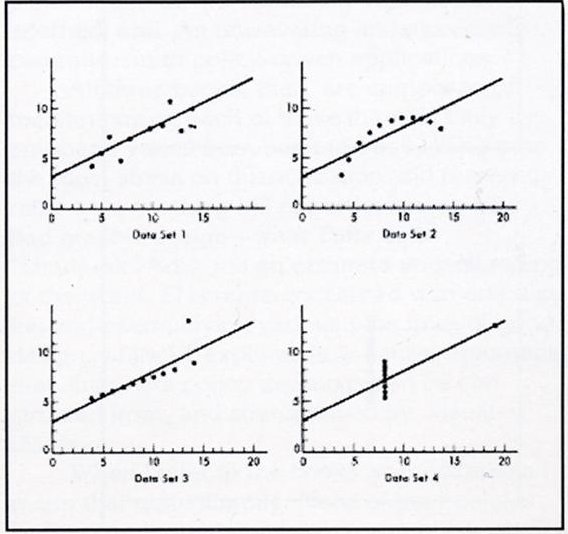
Figure 1
- In some cases, this might result in a completely idiosyncratic design for displaying a unique set of events. Minard's chart of Napoleon's ill-fated March on -- and disastrous retreat from -- Moscow is a case in point (Figure 2). Tufte champions – and in fact actually hawks – this design as possibly the greatest visual display of quantitative information ever devised. It charts the interaction between six variables in the unfolding of an event with massive social, political and human consequences. These variables include: temperature, date, duration, direction, topography, and size of the army.
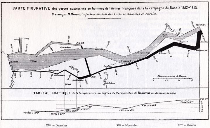
Figure 2
- This chart, however, can be seen as a specific realization of a template with wider utility. After all, Minard also designed a similar chart depicting Hannibal's Campaign through the Alps. Taken together, these two charts demonstrate how an abstract line on a map can depict contingencies that affect a flow of assets over a period of time. The lesson here is that a chart designed for the most specific task might well be useful for more general purposes. Never underestimate the payoff for good design.
- What Michael Gousie and I would like to share with you today is an attempt to think like Minard and to apply some of the craft of an emerging visual social science to displaying information about social stratification. Put simply, we have tried to improve upon a laudable attempt by Steven Rose to graph social stratification in the US today. Although our prototype is very rudimentary we believe it has promise and are eager to discover what other social scientists think about its utility.
- Our critique of Rose is that he succumbed to a common temptation in an age where communication is increasingly visual: using the aesthetics of conventional graphic design to display social scientific findings in a more attractive and compelling package. What needs to be done, however, is for social scientists to think visually, designing displays that expand the explanatory power of our abiding concerns and traditional analytic techniques.
- Steven Rose's work first appeared in 1972 in a small booklet entitled Social Stratification in the United States. It was accompanied by a poster designed by Dennis Livingston (Figure 3). It has since been updated and slightly modified in several editions, the latest of which was published in 2000. The book and poster receive rave reviews on the web and Rose has reported that “It was sometimes called Sociology 101 on a poster“.
- The poster consists of 646 icons, each representing a distinct constellation of household, occupation, and racial types. The icons are arrayed on a vertical display according to household income, going from $O income at the bottom to $80,000 at the top, representing about 90% of the population. Each icon represents either 156,000 people if there is one figure in it, or 312,000 people if two figures (husband wife households). There are a total of 1000 figures displayed in the icons.
| 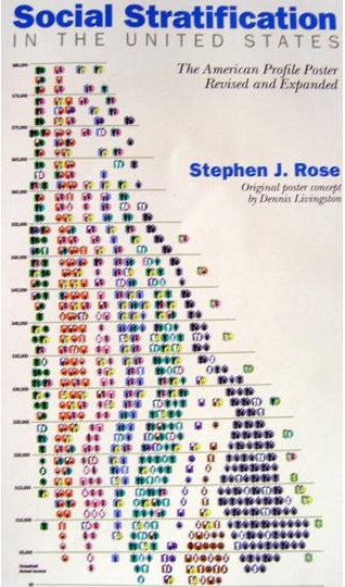
Figure 3
|
- The poster itself has a smaller and more schematic representation of the display on the right side of the poster that has a few icons going as high as $400,000 (Figure 4). Rose tells us that if he was to adequately account for the full range of household income the chart might have to be several stories high.
- Icons encode the following information:
- Family Type: Single; Single with Dependents; Husband/ Wife Couple (Figure 5)
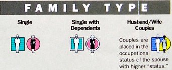
Figure 5
- Race: White; Black; Latinos, Other (Figure 6)
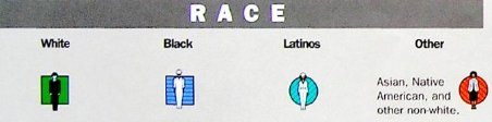
Figure 6
|
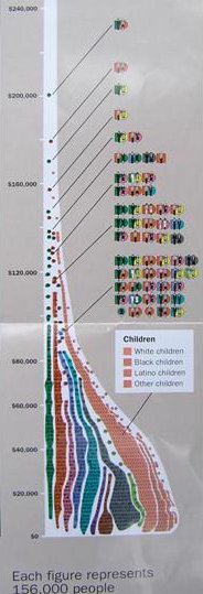
Figure 4 |
- Occupational Category: Administrators/Owners; Professionals; Clerical/Sales; Skilled Blue Collar; Less Skilled Blue Collar/Service; Unemployed; Not in Labor Force; Retired; Farmers/Farm Laborers; Housewives (Figure 7)
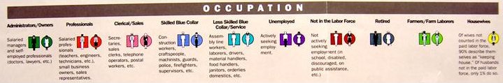 Figure 7
- Rose then provides a set of examples of how to read each icon. These include (Figure 8):
- A black skilled blue collar husband and clerical wife
- A Latino professional husband and wife keeping house
- A single white unemployed woman with dependents
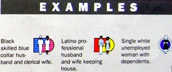
Figure 8
- There are lots of problems with how the data is aggregated for this poster. For our purposes today, however, we will just concentrate on the design issues it raises.
- The major problem with the poster is “figure/ ground“ confusion.
Looking at the display as a whole, all that is really visible are the streams of color that represent occupational categories (Figure 9).
Patterns of race and household composition are not noticeable.
When attention is focused on the content of the various icons, their place in the bigger picture is obscured.
The general effect, then, is to compromise all of the effort that went into designing the various icons.
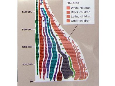
Figure 9 |
In short, most of the detailed information in this chart is, for all intents and purposes, not legible. It's not really fair to disparage it as “chartjunk“ – to use Tufte's term for a chart that conveys little information with lots of design -- because the motivation of the designer is a serious effort to inform and not to dazzle with bells and whistles. But the overall effect is, unfortunately, the same. The design may be attractive and its content arousing (especially the pyramid of inequality that it represents), but it does not draw the viewer into an informed dialog about what the correlates of income distribution might be.
- Rose himself tacitly acknowledges this shortcoming in the text of his booklet, which is for the most part a credible account of patterns of income distribution in contemporary America. To make sense of the patterns reflected in the poster as well as other available information, he devises a small template of the poster, which he uses to graph variation between groups. Let me show you several of these (Figures 10-15).
Figure 10 |
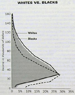
Figure 11 |
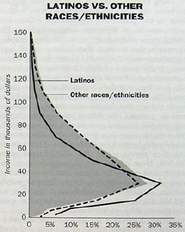
Figure 12 |
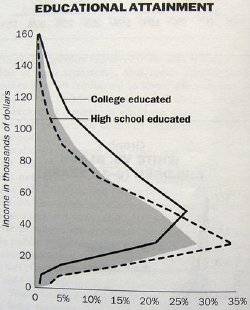
Figure 13 |
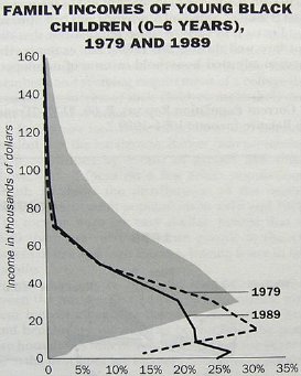
Figure 14 |
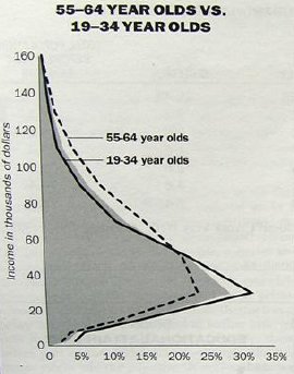
Figure 15 |
- There are three major problems with this template:
- It is too schematic
- It includes lots of interesting variables that aren't on the poster like age and educational attainment
- Controlled comparisons of the impact of the different dependent variables (race, occupation, and household type) require the construction of a new design for each comparison
- In 1994 I offered students in an Introduction to Sociology course at Wheaton College an elective assignment. Could they come up with a better design for the poster, using the basic information that went into forming the icons that Rose includes as a set of appendices in his booklet? My idea was that fresh minds might have new thoughts. Predictably, however, most of the designs were rehashes of the original, with one memorable exception.
- Laura Mark, a first year art student, without having read Tufte, came to me and said that there was no way she could envision putting all of the information on one design. What was needed, she said, was a template that made it possible to compare patterns of income distribution between groups. What did I think of the idea of using a target as the template? The outer ring would start at 0 income and the inner ring would encompass the very highest income category (Figure 16).
That way all of the information in Rose appendices could be encompassed within the compass of a single design making pattern variation more visible. On the screen are two of the targets she designed that clearly show how Black household income is more concentrated toward the outside of the target while White household income clusters in the inner rings.
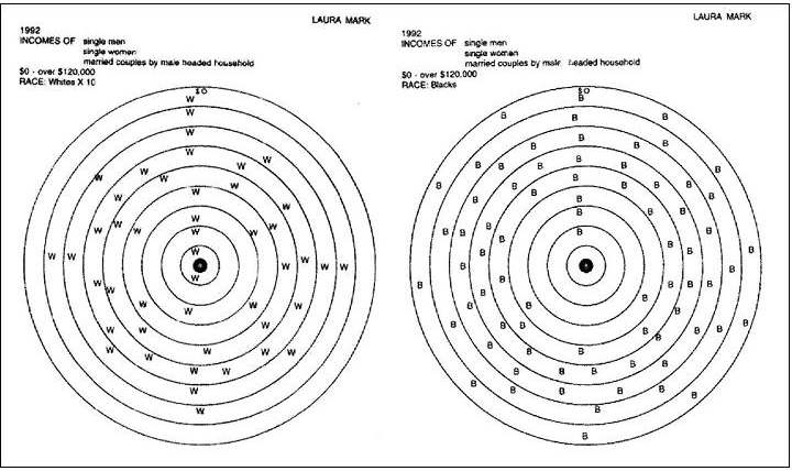
Figure 16
- What Michael Gousie and I have done is to use Laura's insight as a basis for constructing a web-based interactive database.